|
|
Mobile Travel App «Happy Camper»This is one of the most unplanned projects for us. In total, from prototype to launch, it took about six months, more than half of this time was spent on design, this project taught us a lot. But first things first.
The client came to us on the recommendation of a friend. He has been in the tourism business for many years in one of the most tourist-developed cities in Russia, therefore, using the example of a similar application from another country, he saw the missing niche in our country and decided to close it as soon as possible. As usual, first, there was joint work on the functional and technical requirements. Even this did not go quickly, but the main thing is that we have outlined the main directions of work: a mobile application of the user (tourist) and partner was needed, and a personal account of the partner and administrator. 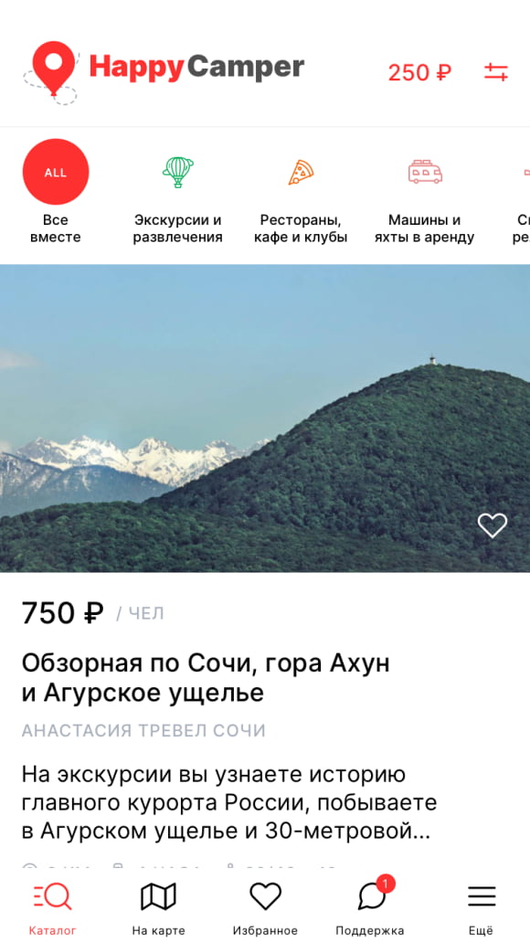 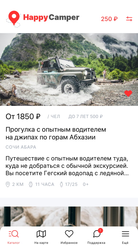 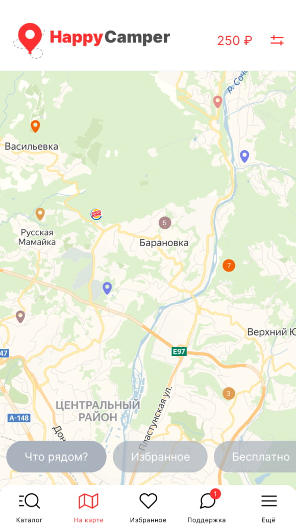 A tourist in his application should be able to view all excursion offers and information on them both in a list and on a map, build a route to the desired place, buy or book a ticket for himself, see his tickets and selected tickets, get cashback, participate in the referral program and use the chat for technical support. The partner can manage the bookings of tourists for their offers (confirm, reject them), activate tickets. It was decided not to describe the admin panel and the partner's online area in detail, but to assemble it during the development of the application. 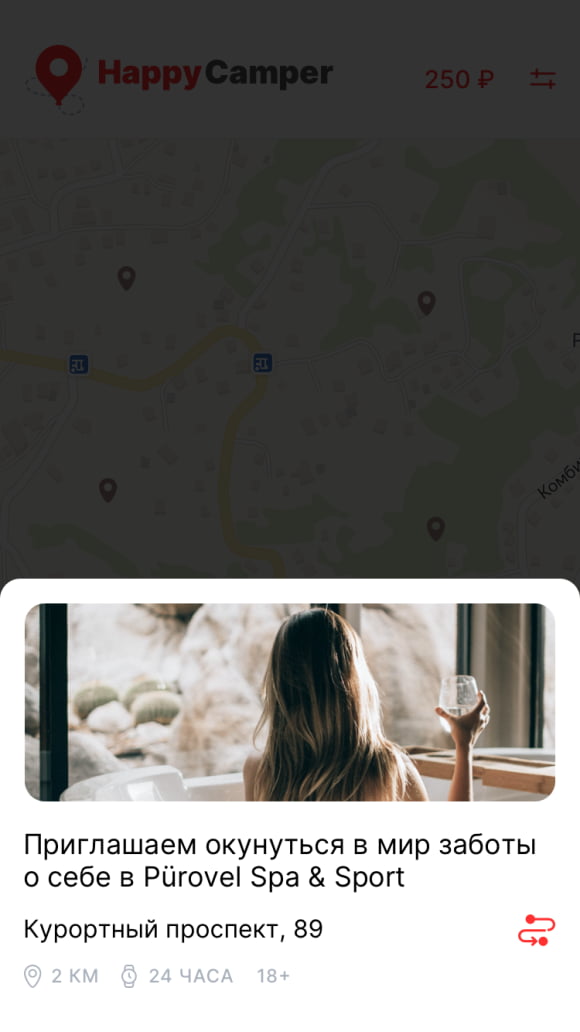 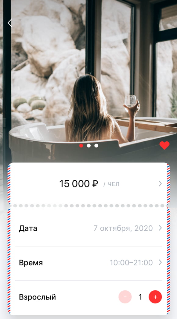 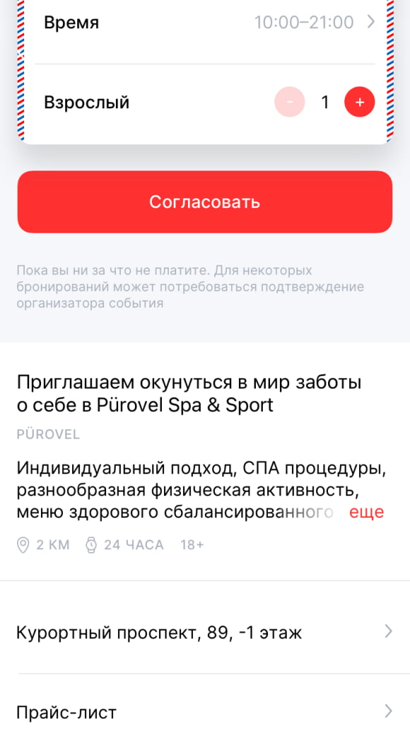 Finally, we got down to the prototype. Here the most interesting thing began - the prototype smoothly flowed into the design because we did not know how to explain the difference. After some time, we almost completed the design of the application, the developers had already taken it into work (another mistake), as a new employee appeared on the Customer's side, who was entrusted with working on the application and... he began to redo a lot for himself. Yes, some of the suggestions were very sensible, but some caused a heated discussion among our team. As a result, we postponed some ideas to new stages, because this was not discussed during budget estimation, though, we still did a lot not according to the FTR (error). At some point, «wishlist» has grown to the size of a new application. 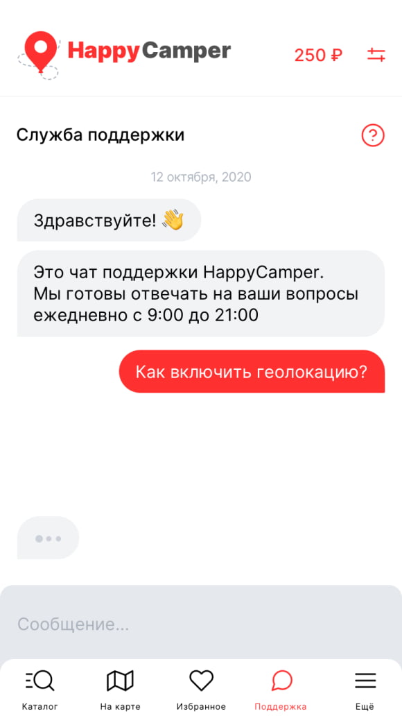 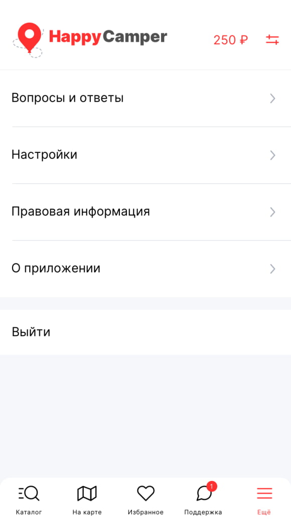 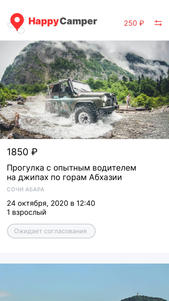 Then we said «stop», we'll do it only according to the technical specification, launch the app, and only after that we'll take new requests into work. Not only we needed this launch (for example, our designer was almost «burned out» from the seemingly endless reworking of the same project every day), but also the customer — the tourist season had already opened, but the application had not yet been even launched in beta. 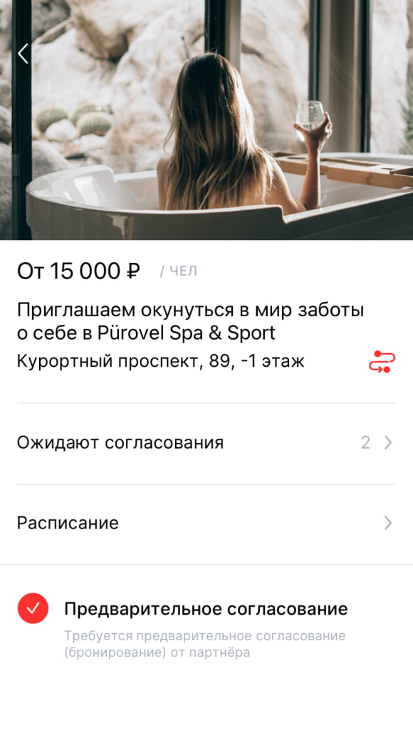 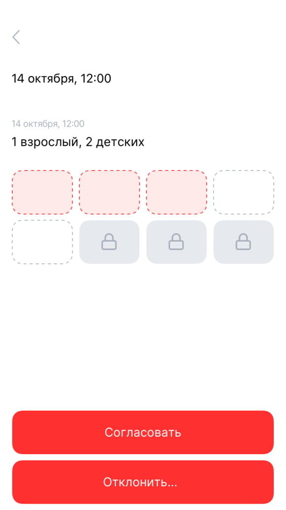 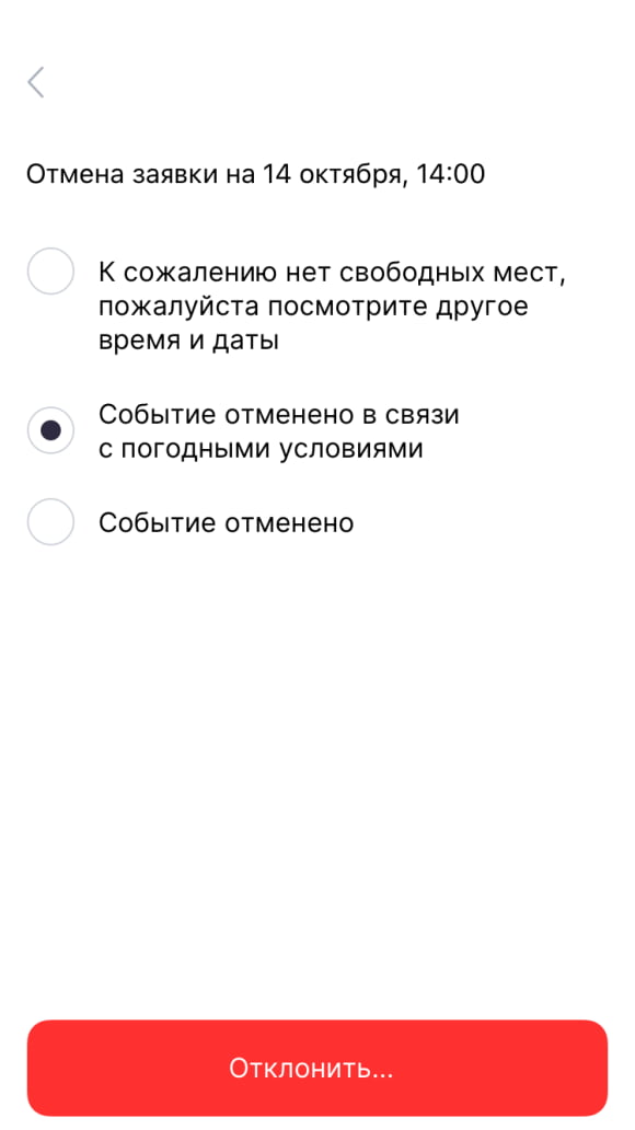 As a result, after a relatively short time, the application was checked for errors, put finishing touches, and launched. Over time, it became obvious that the right decision was made, and instead of endless improvement of not very necessary functions, the customer received user experience and feedback on his application. Having received this experience in a timely manner and faced with real cases, the customer took a break. And only recently he customer returned to us with a new interesting proposal and improvements. We hope you will find out about them soon.
So, what lessons did we learn from analyzing this project::
Leave a request on our website. We will call you back and discuss how best to implement your project, what development methodology is better to choose in your case, and much more. Hurry, we still have so much to discuss! |