|
|
College of HairdressingThe workshop of precise haircuts and coloristics "ABC", relying on its many years of experience in the field of beauty and the experience of world schools, decided to raise the level of hairdressing in the city and opened a College of Hairdressing
TuskCreate an informational website for a company that trains some people to make other people beautiful. Since the college operates on the basis of an educational license, it is imperative to take into account the legal requirements for the websites of educational institutions.
In the process of working on a project, many ideas and hypotheses appear. This is fine, but what if there is no time? One of the options is to sketch a concept and discuss it with the customer. There is a chance that this is just what you need. Looking ahead, I will say that they refused such a presentation of the material and this is rather a bad experience. As a result, they did it as usual: prototype, then design, then put it into work.
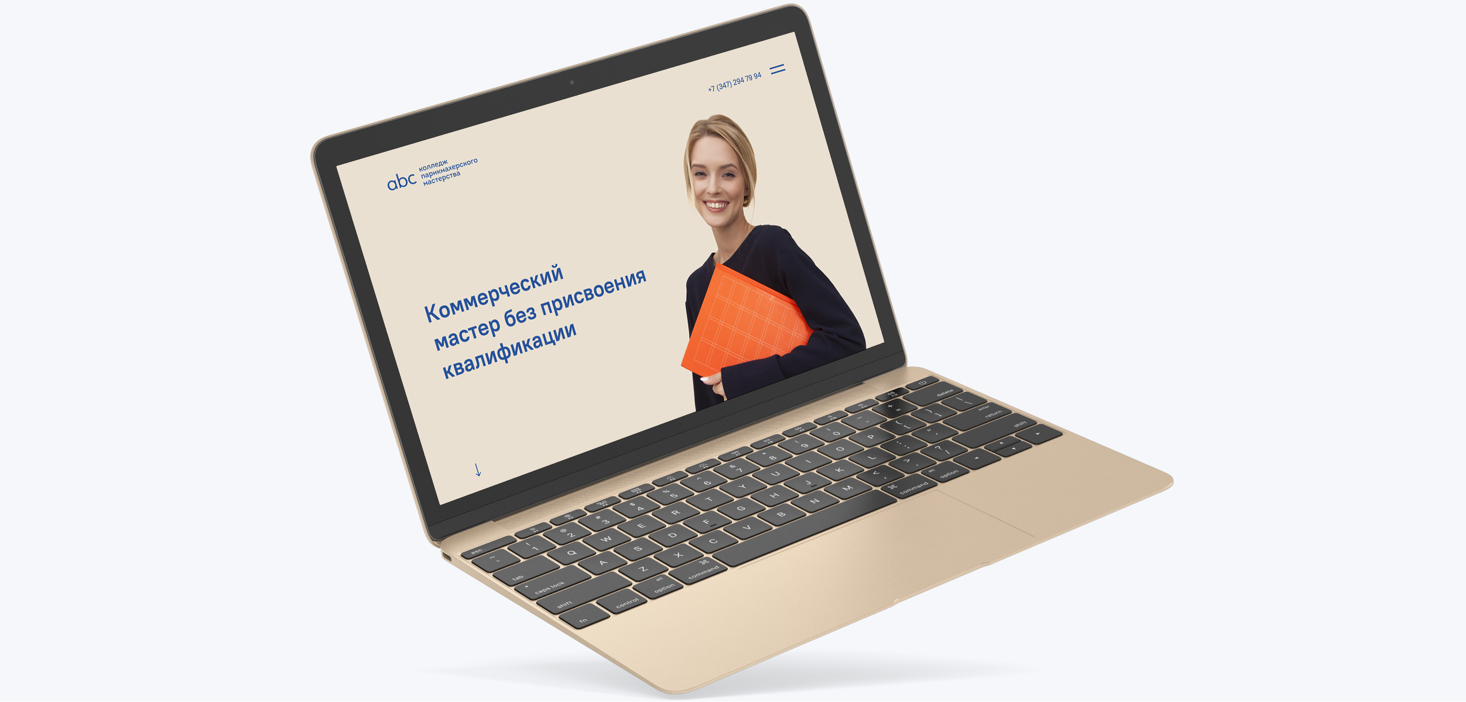
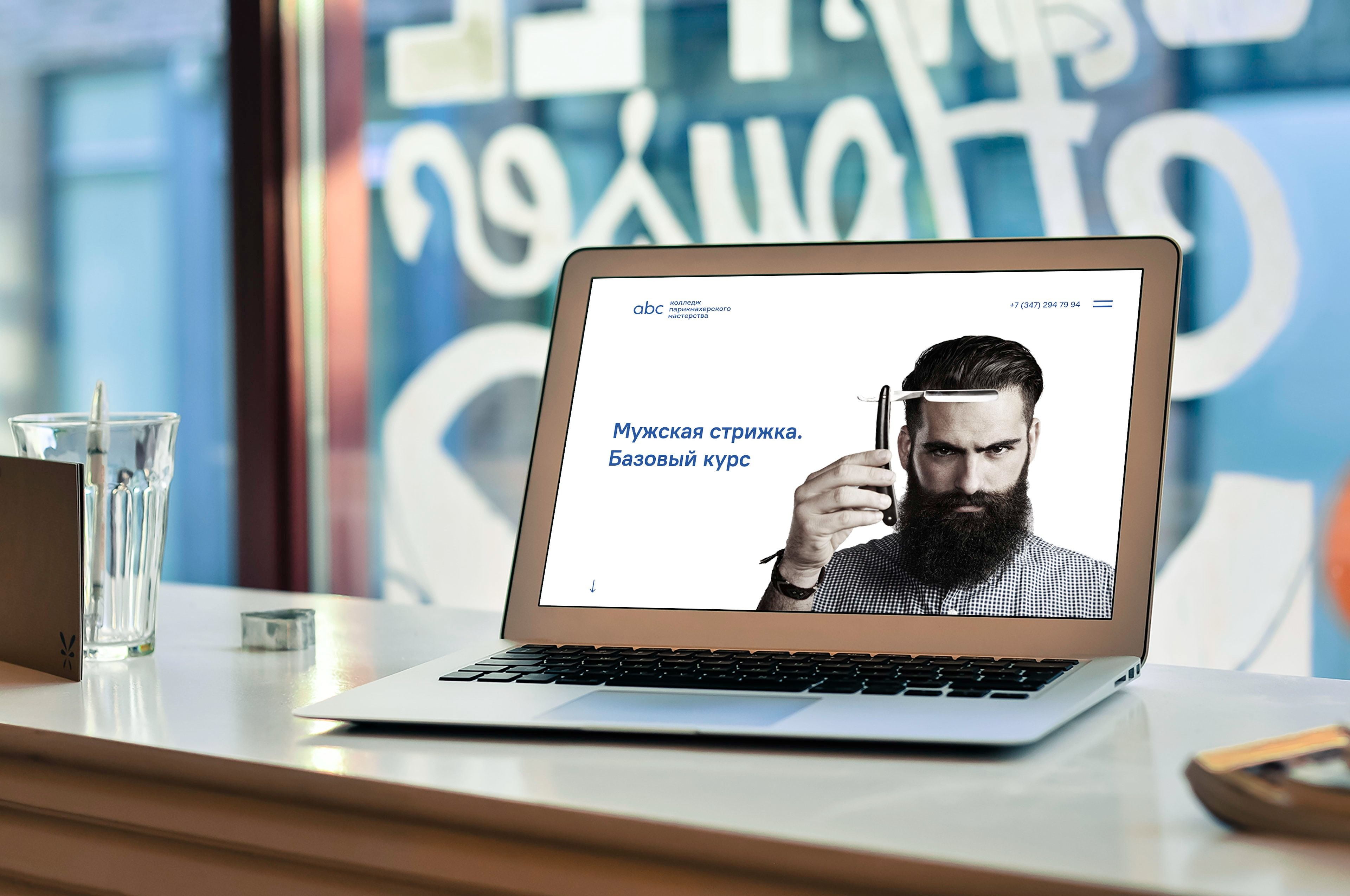
Mobile firstWe used the "Mobile first" method. It was required to show the most important thing in the first place and "in small portions". The layout was divided into 3 parts. At the start, we show one of the directions.
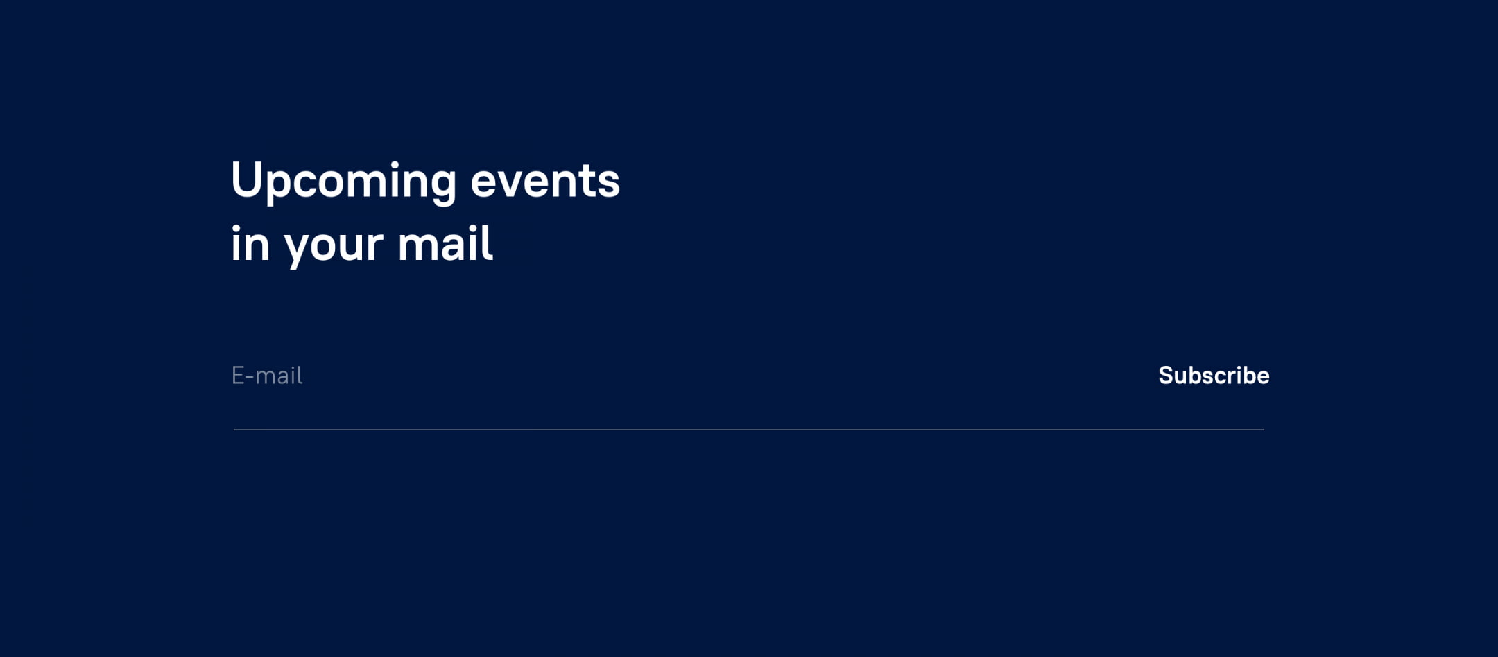
It can be a slider with a specific direction or a looped video. Minimum information — on this screen we are trying to hook the future colorist. Then we show literally 3 upcoming events and use a non-standard grid and contrast to direct and involve.  The final one is a call to action. There is a lot going on in college and you just need to leave your email address to be "in the know". Of course, this is the first step and mailing lists could be developed in the future. Make a , for example.
 Don't forget about contextWhere and when will the site be used? Here the menu moves to the right and the telephone for communication appears. The cap is fixed and the contacts are always in sight.
 Step backA volitional decision was made — to abandon the concept and return to more familiar patterns. The client's request is to stick to the prototype.
 Let's start overThere are many directions and there could be even more. Experimenting with horizontal scrolling and realizing that this is a so-so solution... We look further. 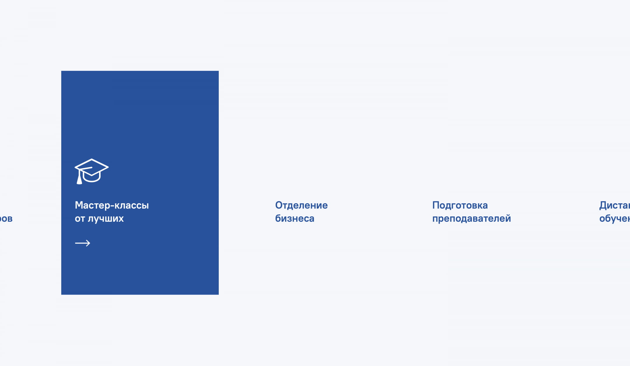 We arrange the schedule in blocks and break it down with clickable logos of popular sites and services. Ideally, this should resemble Instagram. 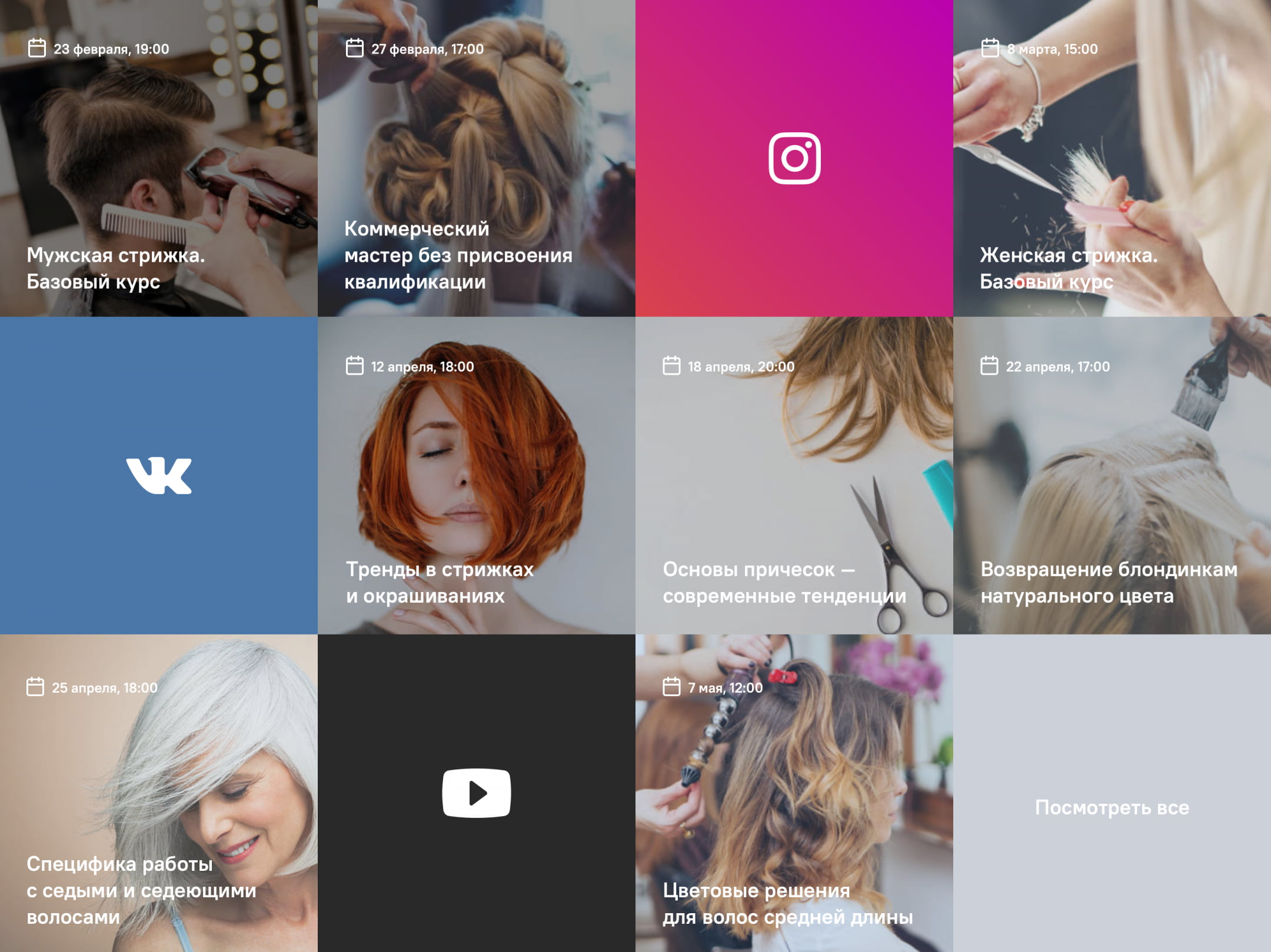 Do not touch the start screen. In the future, there will be standard horizontal navigation and a direction slider. The site editor, with the help of the constructor, will be able to independently create slides and set the required time interval for changing frames.
 We collect directions as well as the schedule in blocks, show how it will look in operation. The starting line is nearing completion. We are jointly testing interactive prototypes with the client, working with color, minor edits and improvements. The decision is made by the clientHere is an important point — we offer solutions, but the decision is made by the client, and if any controversial situations arise, we try to find real reasons and speak it out. We avoid opinions. We rely on metrics, statistics and hard facts. In parallel, work is underway on the inner pages.  ResultIt turned out 3 semantic blocks: a slider, college directions and a schedule 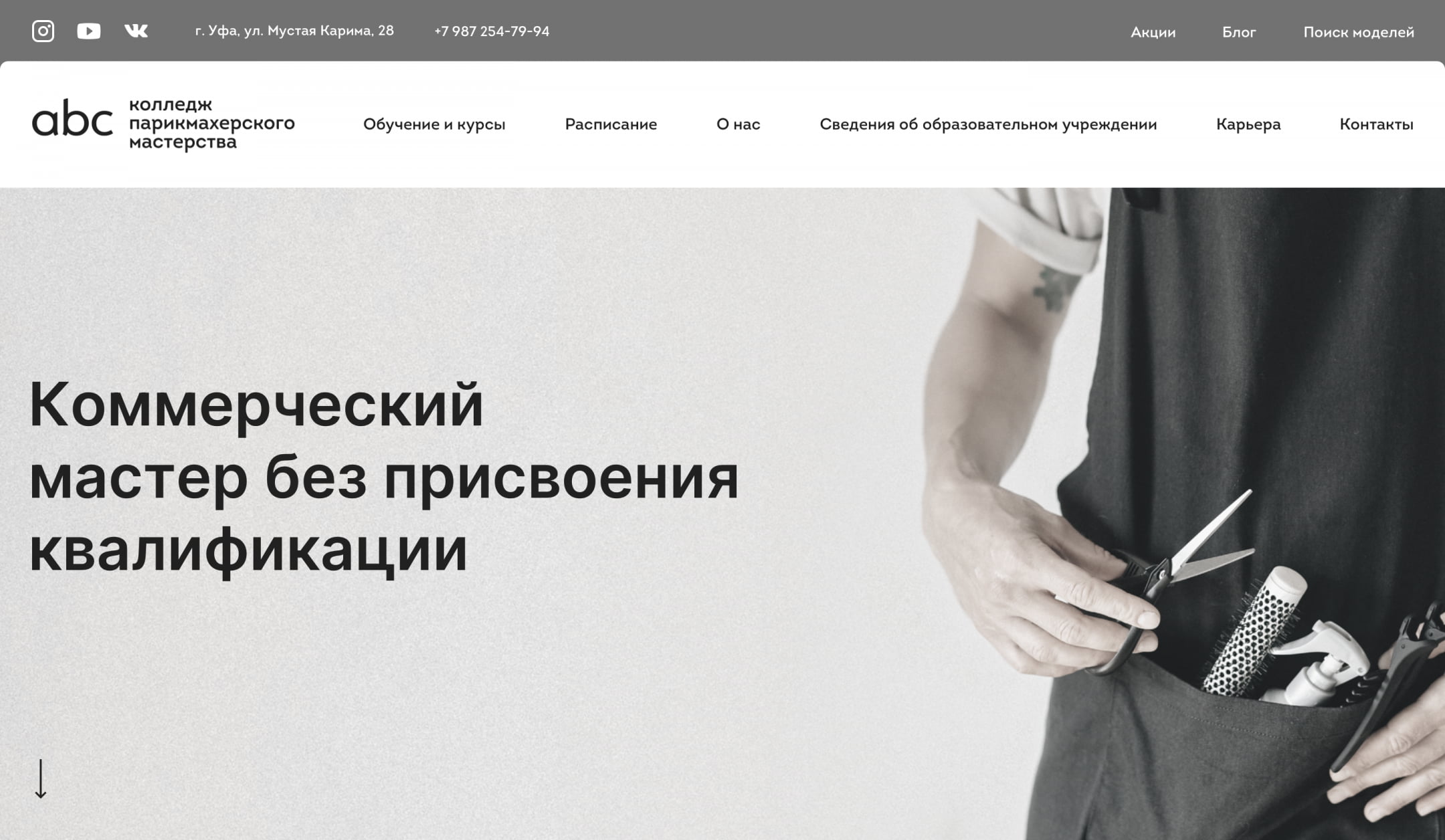 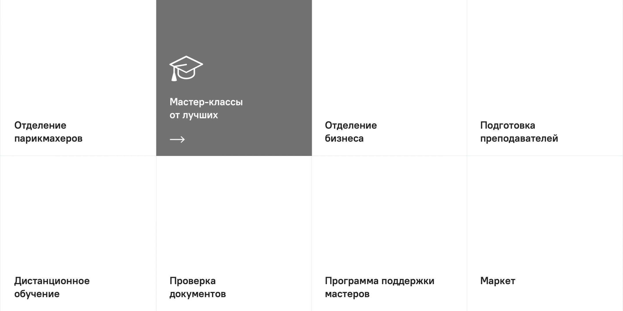 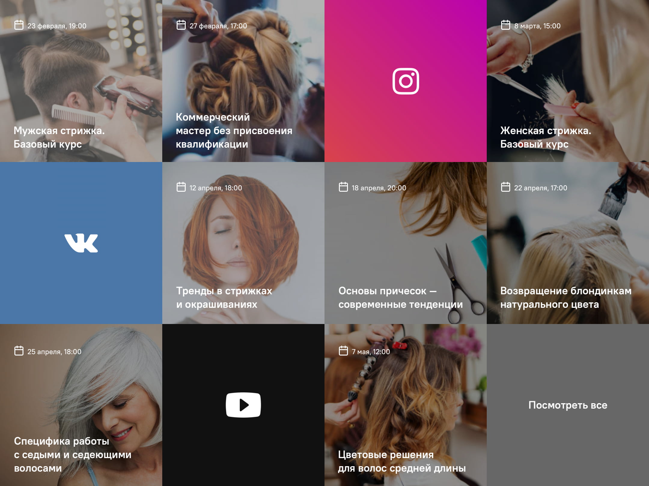 The Atma company expresses its gratitude to Natalia Kotler for her patience and all-round help in the work on the project. |